YouTube New UI: What Users Are Actually Saying on Reddit, X, and Social Media
AI Quick Summary
- YouTube's October 2025 UI redesign triggered significant backlash across social media, with many users criticizing it for "fixing what wasn't broken."
- Common complaints included frustrating changes to the "Save to playlist" feature, a perception of the interface being overly simplified or "upscaled," and the removal of comments when scrolling in full-screen mode.
- Users also disliked the aesthetic, comparing it to "Apple minimalism" or interfaces designed for "elderly phones," and pointed out issues with the volume bar and a "squished" appearance on mobile.
- Despite widespread criticism, some users found the new UI appealing, and the introduction of threaded comments, similar to Reddit, was a positively received feature.
- In response to the changes, a community of users developed workarounds, including browser extensions, to revert the UI, while YouTube officially directed feedback to its internal tools.
As of early 2026, no significant changes or reversals to this UI redesign have been widely reported, suggesting users have largely had to adapt.
YouTube's October 2025 UI redesign has sparked intense debate across social media platforms. Reddit's r/youtube community has been flooded with reactions, while Twitter/X users haven't held back either. Here's what people are actually saying—both critics and supporters.
The Critics: "Fixing What Wasn't Broken"
According to Piunikaweb, the backlash has intensified significantly, with Reddit's r/youtube community "practically exploding with reactions." Thread titles range from "This new UI sucks" to desperate pleas about specific features.
The Harshest Reactions
On X (formerly Twitter), users haven't minced words. Distractify reports users calling it "disgusting dogsh*t" and saying it makes them feel "like a toddler on a tablet." One user, @naitikusu, tweeted: "New YouTube UI design dropped and it somehow got even worse. Horrible icons + spacing. Graph is ugly and jagged. Some labels just say 'null'. Can't do a single thing about the comment bots but manages to pump out 18 redesigns a year."
Specific Feature Complaints
Power users are particularly frustrated about the "Save to playlist" feature changes. One Redditor explained that for users organizing thousands of videos, the redesign turns "a simple three-step process into six or more repetitive clicks." The complaint: "This ruins a perfectly decent feature for absolutely no good reason."
Android Authority quotes one user on large-screen monitors: "It might not be so bad for a smaller display, but it literally feels like an upscaled iPad." Another complained: "I can get used to different buttons, but what absolutely sucks is that scrolling down in full-screen mode now pulls up a list of other videos rather than the comments as it did before."
The Apple Comparison
Creative Bloq reports widespread complaints about YouTube copying Apple's design language. "I don't like it. I much rather prefer the UI from back in the mid-2010s," one Reddit user wrote. "I still hate it when social media companies went all in for 'Apple minimalism.'"
Another user added: "If you copy Apple's ugly bullsh*t, you will end up with ugly UI that looks cheap at the same time." Yet another chimed in: "Everything is starting to look like Apple, not that Apple is a bad thing, but every big company is losing their identity to something nobody ever even asked for."
Elderly Phones and Toddler Tablets
Multiple sources report specific design comparisons. One Redditor compared the interface to "those phones for the elderly," while others described feeling infantilized by the larger, more simplified buttons.
The Defenders: "Actually, It's Not That Bad"
While critics dominate the conversation, supporters do exist—though Piunikaweb notes "those voices are drowned out by the majority who see this as another case of fixing something that wasn't broken."
Positive Takes
Tom's Guide writer Malcolm McMillan stated: "Personally, I find the new YouTube look appealing, if a little too large, but not distractingly so."
- "I actually don't hate the new UI"
- "call me crazy but i think the new ui is kinda good"
Buried in comment sections, a few users admit they're "fine with the changes, or at least indifferent." One Tom's Guide commenter on an earlier article said: "On the other hand, there's an argument that it appears a bit more streamlined and allows users to better see the next video on smaller screens."
One Feature Users Like: Threaded Comments
Interestingly, Tom's Guide reports "the new feature that people on Reddit do seem happy about is the new comments section which has introduced 'threading' that looks very similar to how comments on Reddit work."
The threaded comments allow users to follow conversations more easily with up to three levels of threading in the replies panel—a feature that actually drew praise even from otherwise critical users.
Meta-Reactions: Tired of Complaining
The backlash has gotten so intense that meta-threads are appearing on Reddit, like "Can people stop posting about the new ui?" and "Time for another meme of people here talking about the UI," showing just how saturated the conversation has become.
Creative Bloq notes "the YouTube Reddit page is utterly awash with complaints about the new look right now, with users asking, nay, begging, for any advice on how to roll back the changes (spoiler alert: you can't)."
The Workaround Community
For those desperate to undo the changes, users are already sharing workarounds. "There's already a workaround making the rounds for the web version. Users are sharing a Stylus extension script that reverts the player to its previous look."
The report notes: "So essentially, power users are installing browser extensions just to get back the YouTube they had yesterday."
YouTube's Official Response
TeamYouTube's official response? The standard "we're all ears" line, directing frustrated users to the feedback tool. When users tagged YouTube on X, like @Sir_Cleric calling the change "needless," TeamYouTube responded with their typical feedback request.
Piunikaweb comments: "They've also asked users to share their feedback, but I wouldn't hold my breath for any big changes to the new UI anytime soon, even if there's a lot of backlash."
What Actually Changed
The redesign launched globally on October 13, 2025, with these specific changes:
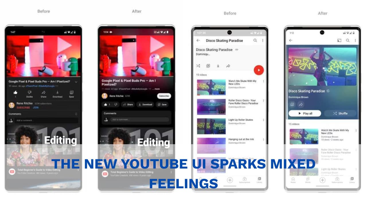
- Updated video player with new icons and more transparent elements
- Pill-shaped buttons for controls
- Threaded comments similar to Reddit (up to three levels)
- Refined double-tap seek feature described as "more modern and less intrusive"
- Smoother transitions when switching between tabs on mobile
Android Authority reports the new UI features "buttons for each prominent action. The Play/Pause button is prominent, followed by the Next button, the video timestamp, and video chapters—all in their own pills/capsules."
The Volume Bar Controversy
A specific complaint centers on the audio slider: "Some users are especially displeased with the audio slider" and report they "can no longer scroll on the volume bar to adjust volume."
One user wrote: "Really odd change IMO. Not inherently against the little islands in theory, but readability suffers without the vignetting from the old design. Also, the progress bar sits so far up the screen now, I almost wish that they put it underneath the controls or something, because it's genuinely distracting."
Mobile App Changes
Tom's Guide covered mobile-specific changes where "all of the information you need about the channel is located directly underneath the video" in the current version, but "the new UI completely removes the channel name, instead leaving only a username."
The uploader's icon increased in size and moved to sit next to the video's title, while join and notification options now live next to the like and dislike buttons. User consensus: "the UI looks far too 'squished' or 'crouched.'"
Not the First Rodeo
Distractify reports this theme from users: "frustration mixed with fatigue. Users feel like they're constantly relearning how to use a platform they've already mastered."
One user summarized: "The point is, people aren't against change. They're against unnecessary change. Especially when it breaks things that worked perfectly well before."
Creative Bloq philosophizes: "There's probably an aspect of the shock of the new at play here. Much like changes to home screen icons, which often draw ire since users see them every day, changes to the YouTube player affect something many internet users stare at daily."
The Verdict from Online Communities
The overwhelming sentiment across Reddit, X, and other platforms skews negative, though the intensity varies from mild annoyance to profanity-laced fury. Supporters exist but are significantly outnumbered in public forums.
As one source concludes: "Whether you love it, hate it, or fall somewhere in between, this redesign has certainly sparked one of the most divided reactions to a YouTube update in recent memory."
The backlash has been loud, sustained, and specific—focusing on lost functionality, unnecessary changes, and design choices that feel like steps backward rather than forward. But some users genuinely don't mind the changes, and a few even prefer them.
Time will tell whether YouTube makes adjustments based on feedback or whether, as usually happens, users eventually adapt to the new normal—however begrudgingly.
This article reports on actual user reactions from Reddit, X/Twitter, and other online communities. Quotes have been sourced from verified posts and articles. For official YouTube updates, visit the YouTube Updates page.
If you enjoyed this article, follow us on WhatsApp for daily tech updates. If you have an idea, need to be featured or need to partner, reach out to us at editorial@techinika.com or use our contact page.
Don't let the story end here.
Share your thoughts, ask questions, and connect with the community.

Cishahayo Songa Achille
Chief EditorCishahayo Songa Achille is a Rwandan software engineer and tech entrepreneur focused on democratizing digital skills. He is best known as the Founder and Managing Director of Techinika, an edtech firm established in 2020 to make complex technological advances accessible to the general public and build solutions for the biggest problems.
View all articles by Cishahayo Songa Achille →